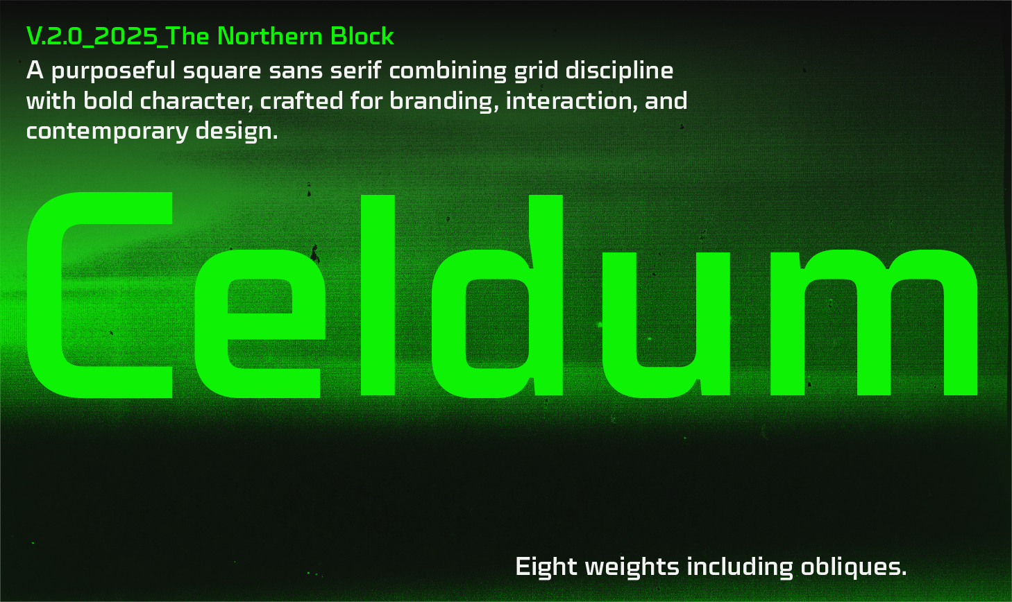
Celdum V.2.0 - Type Family
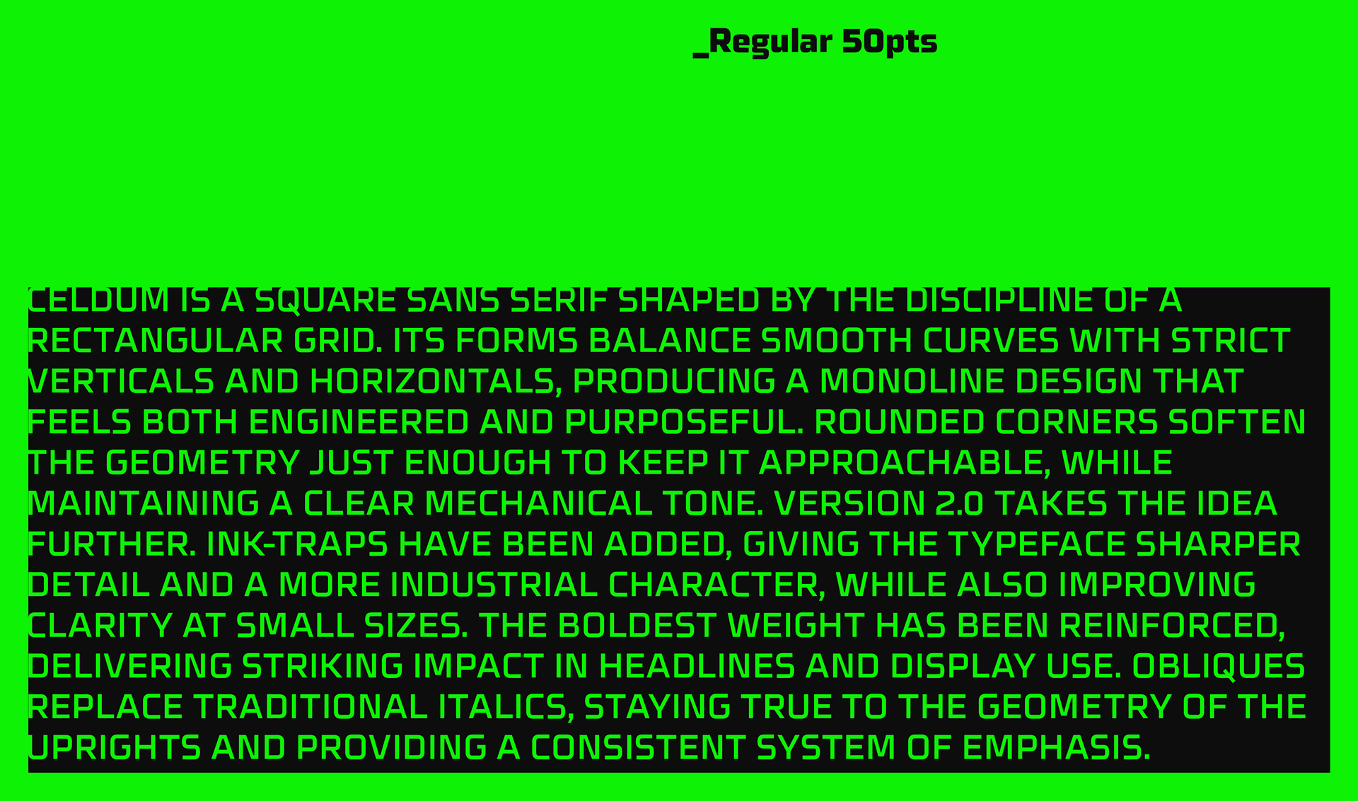
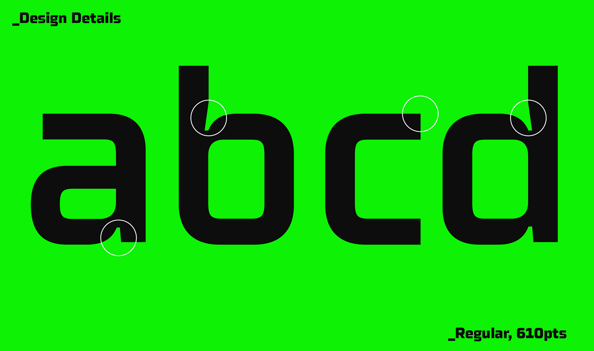
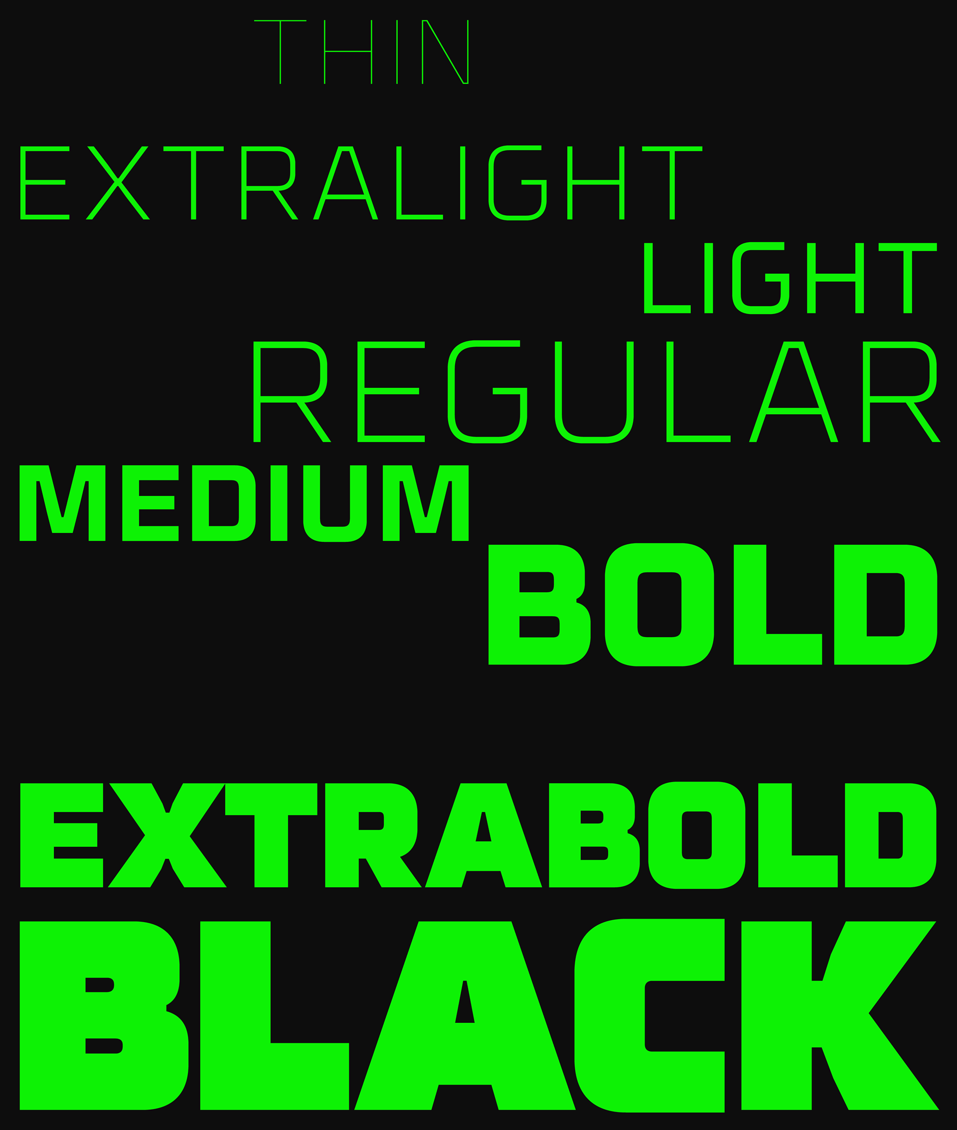
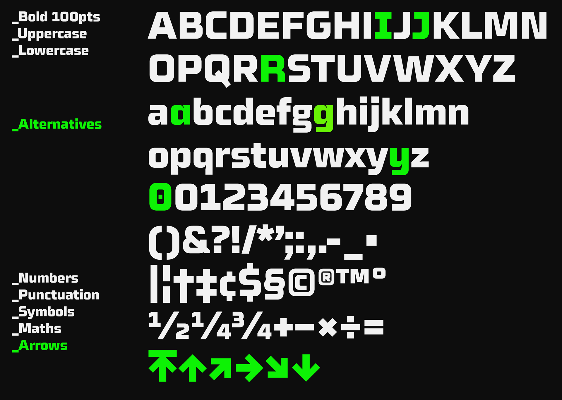
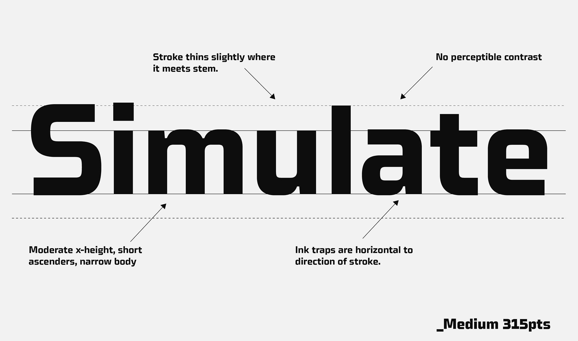
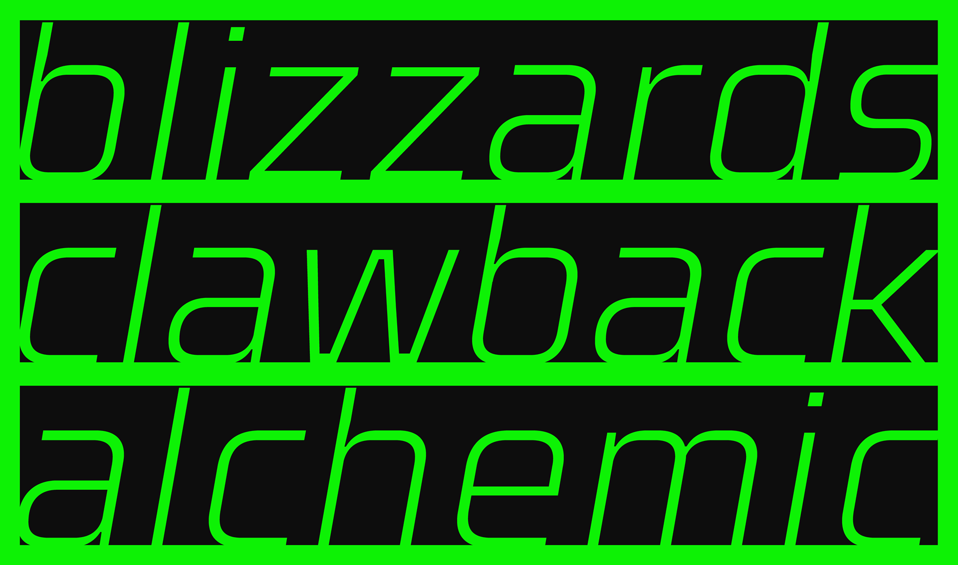
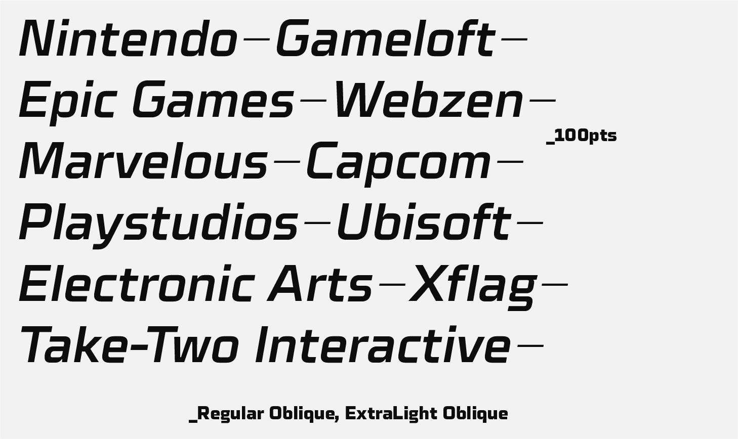
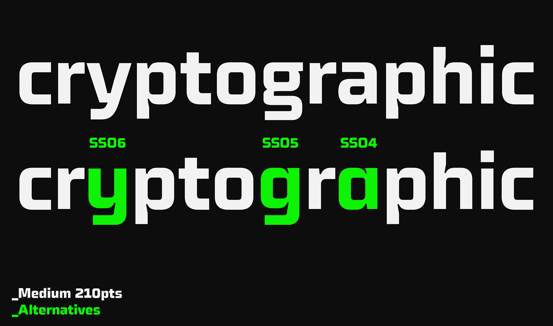
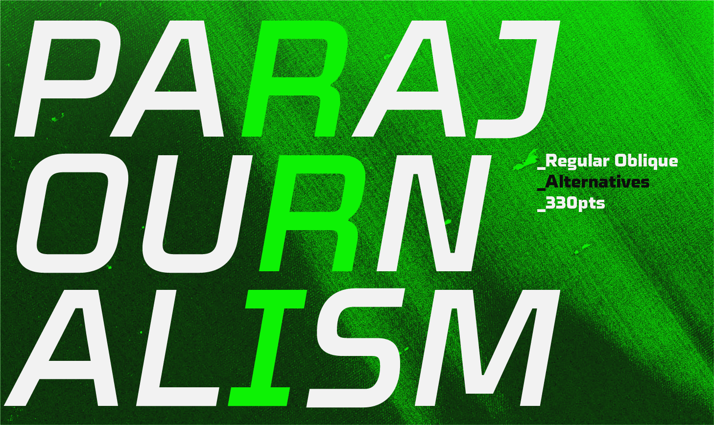
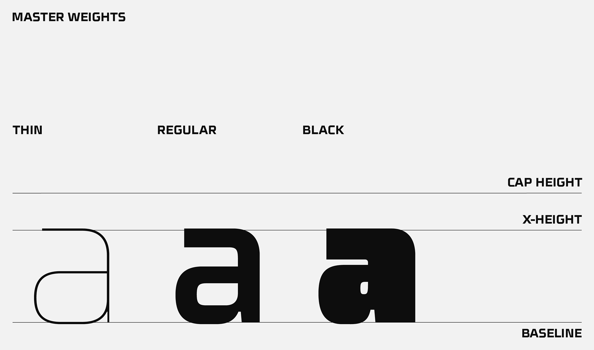
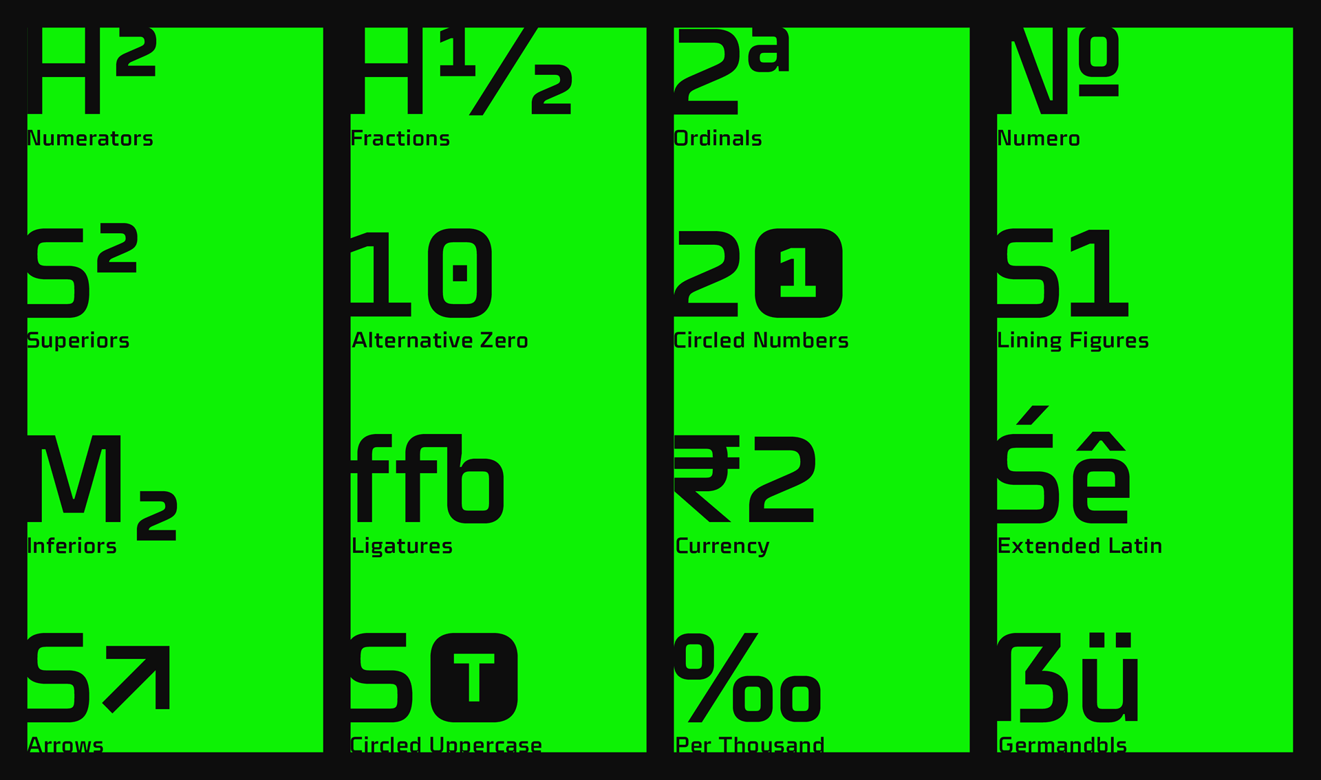
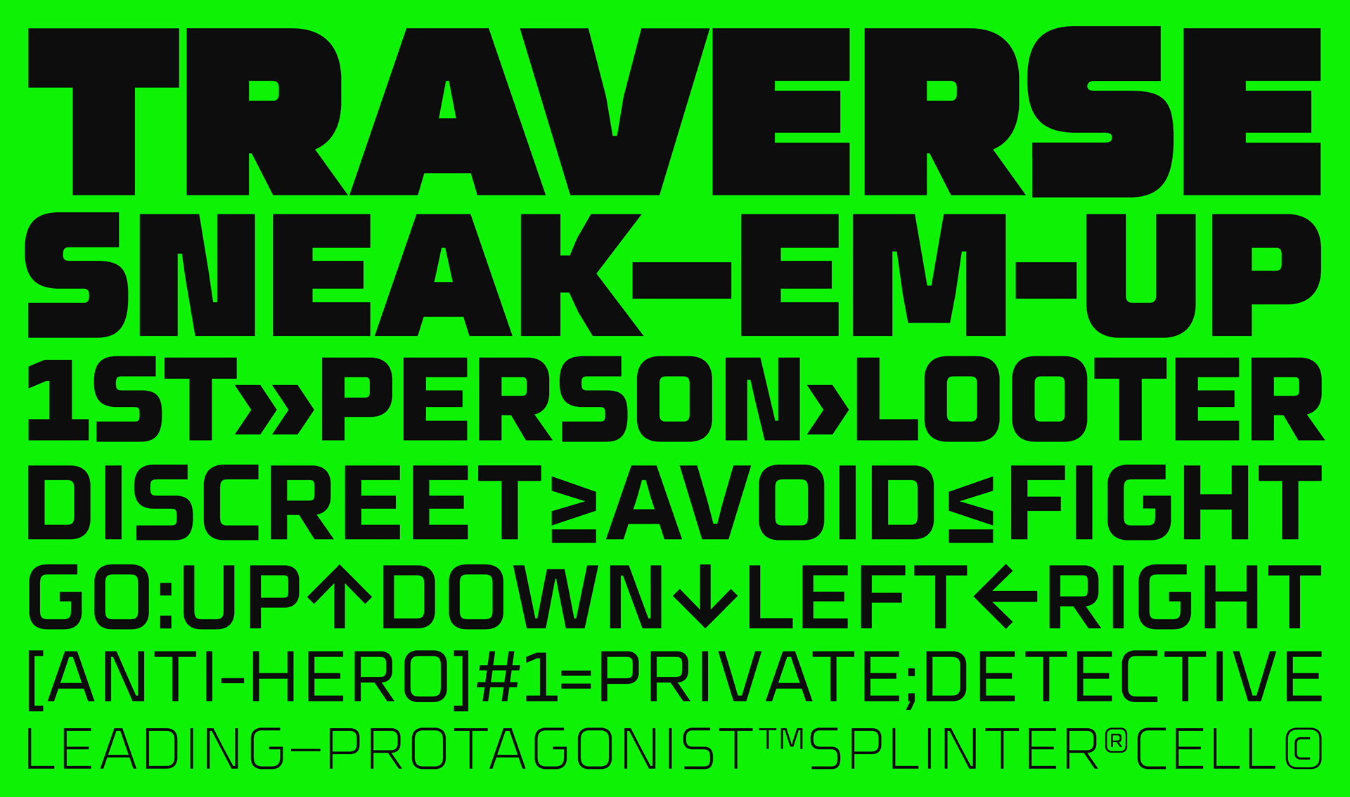
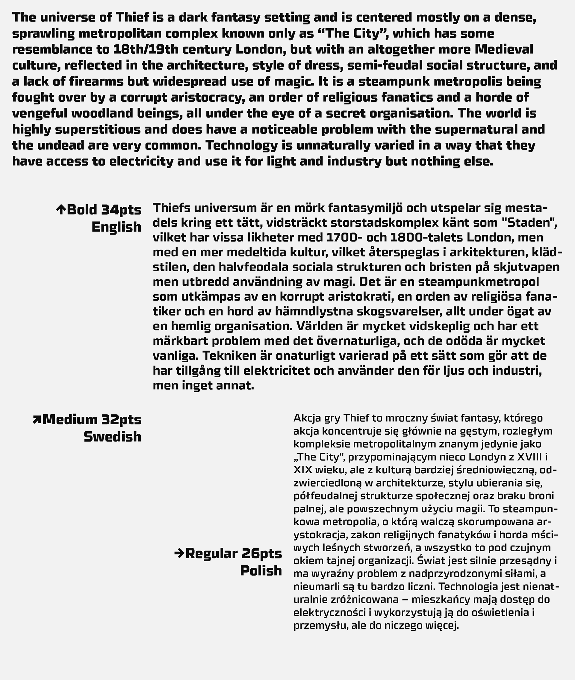
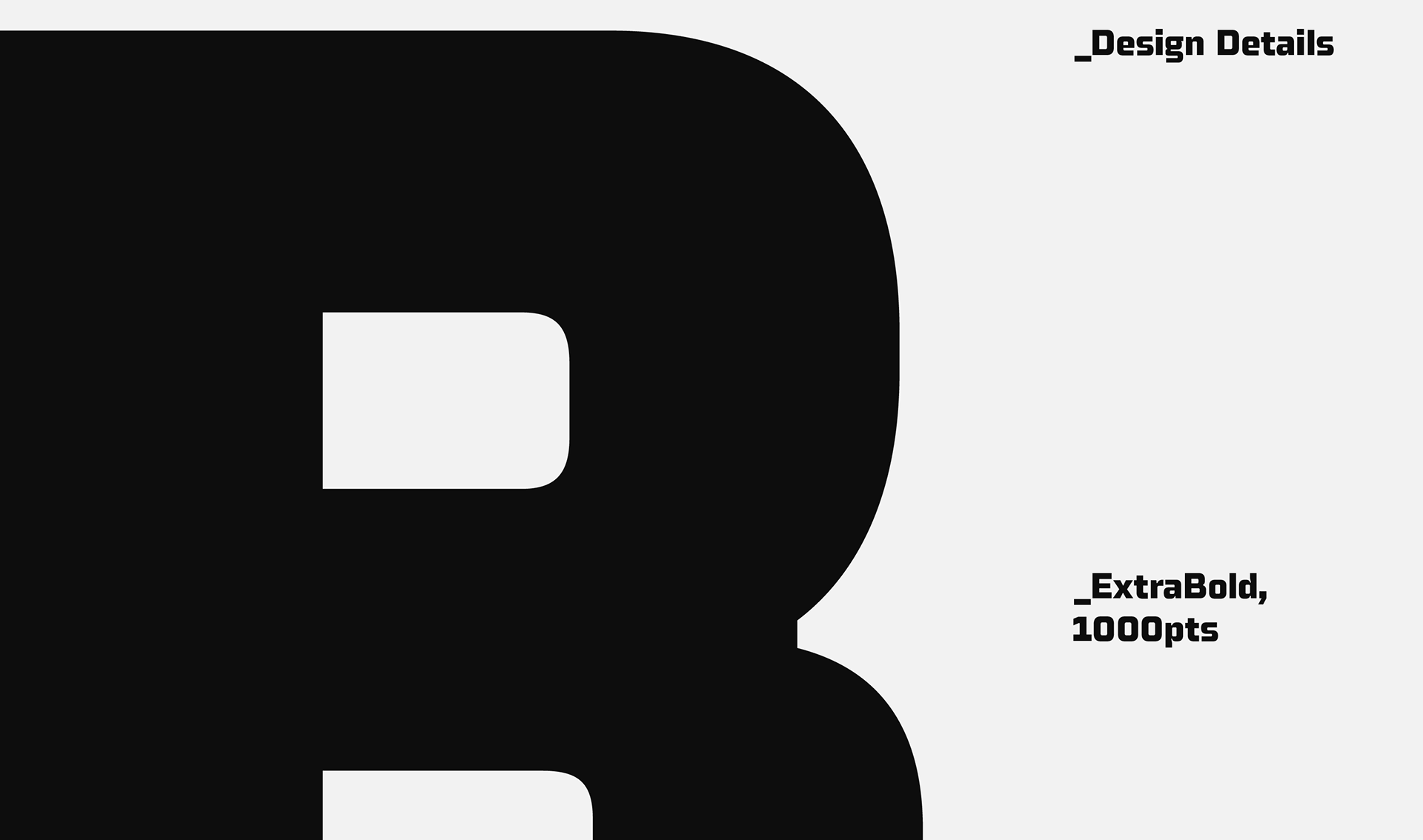
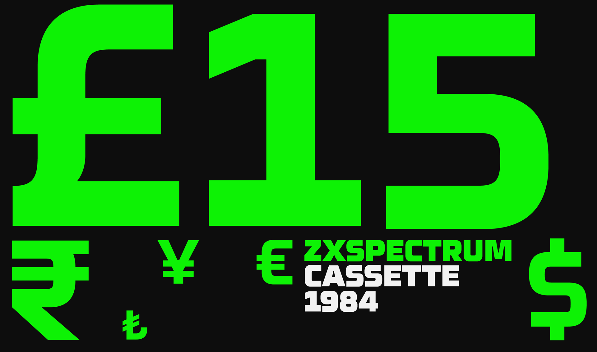
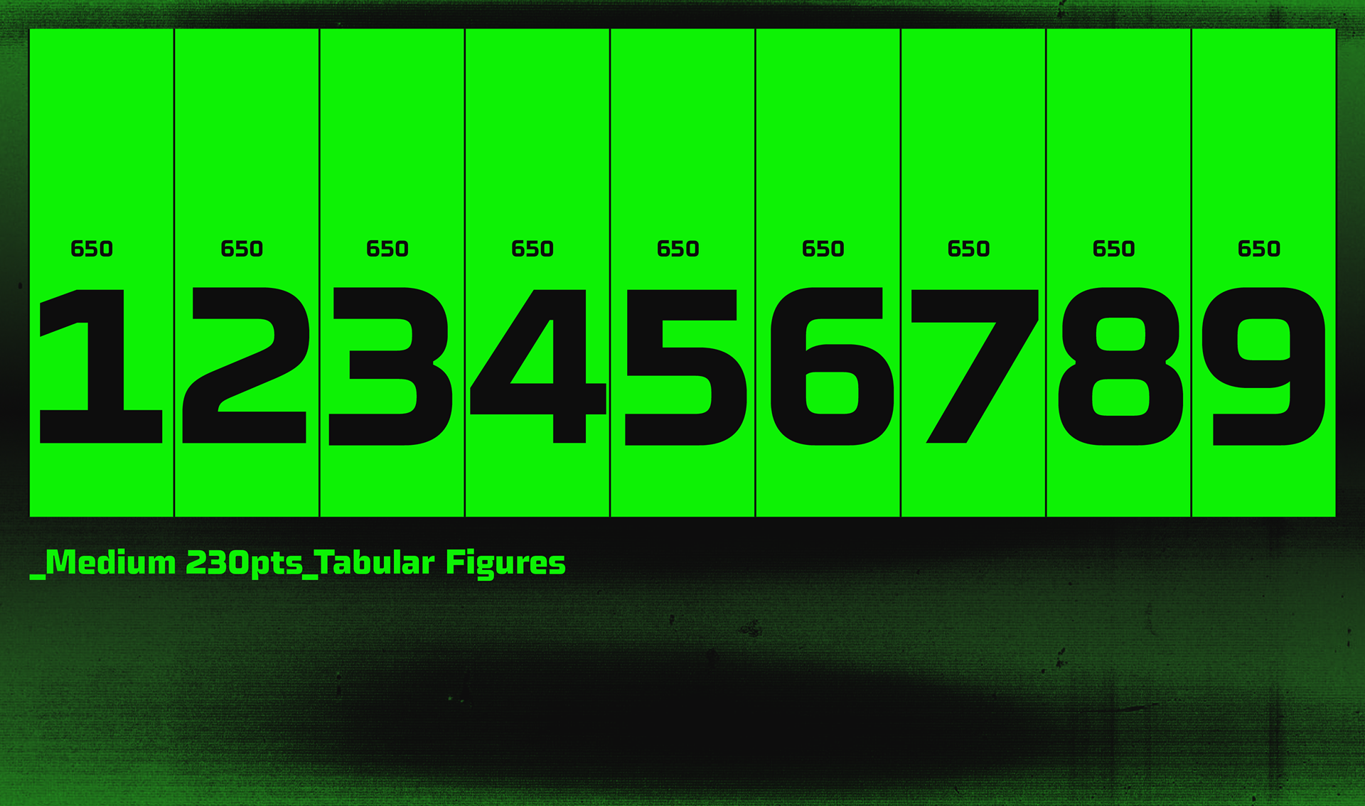
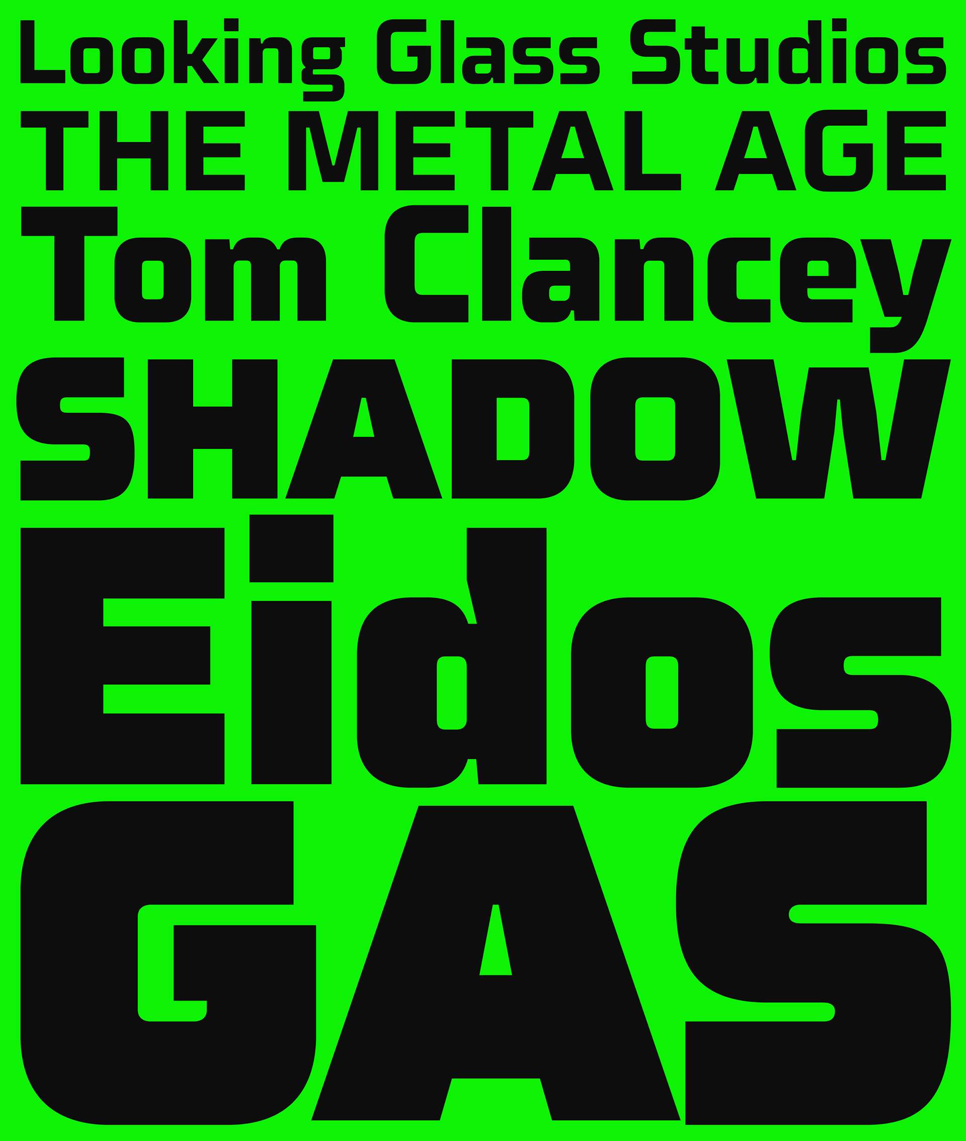
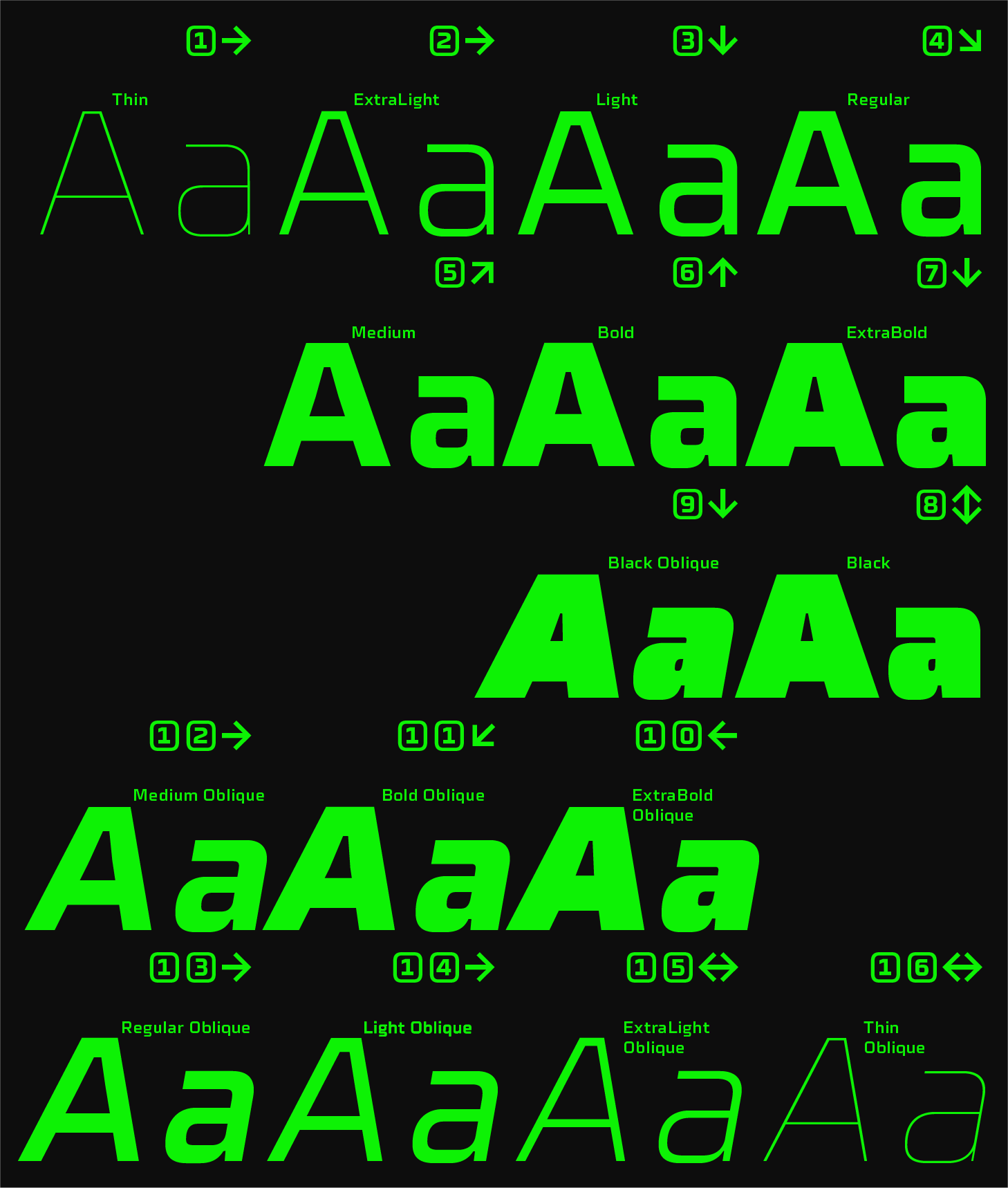
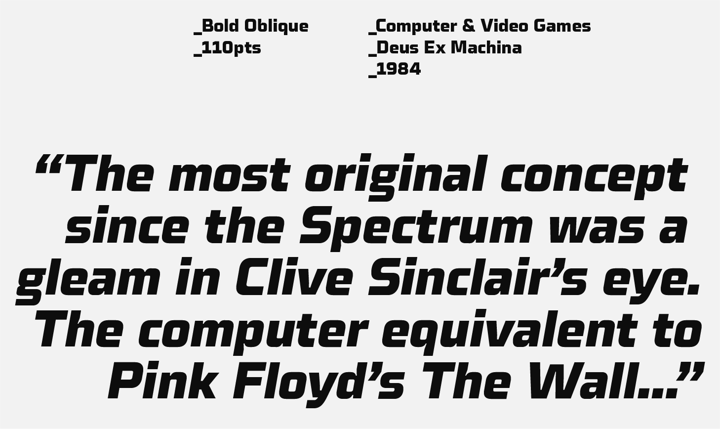
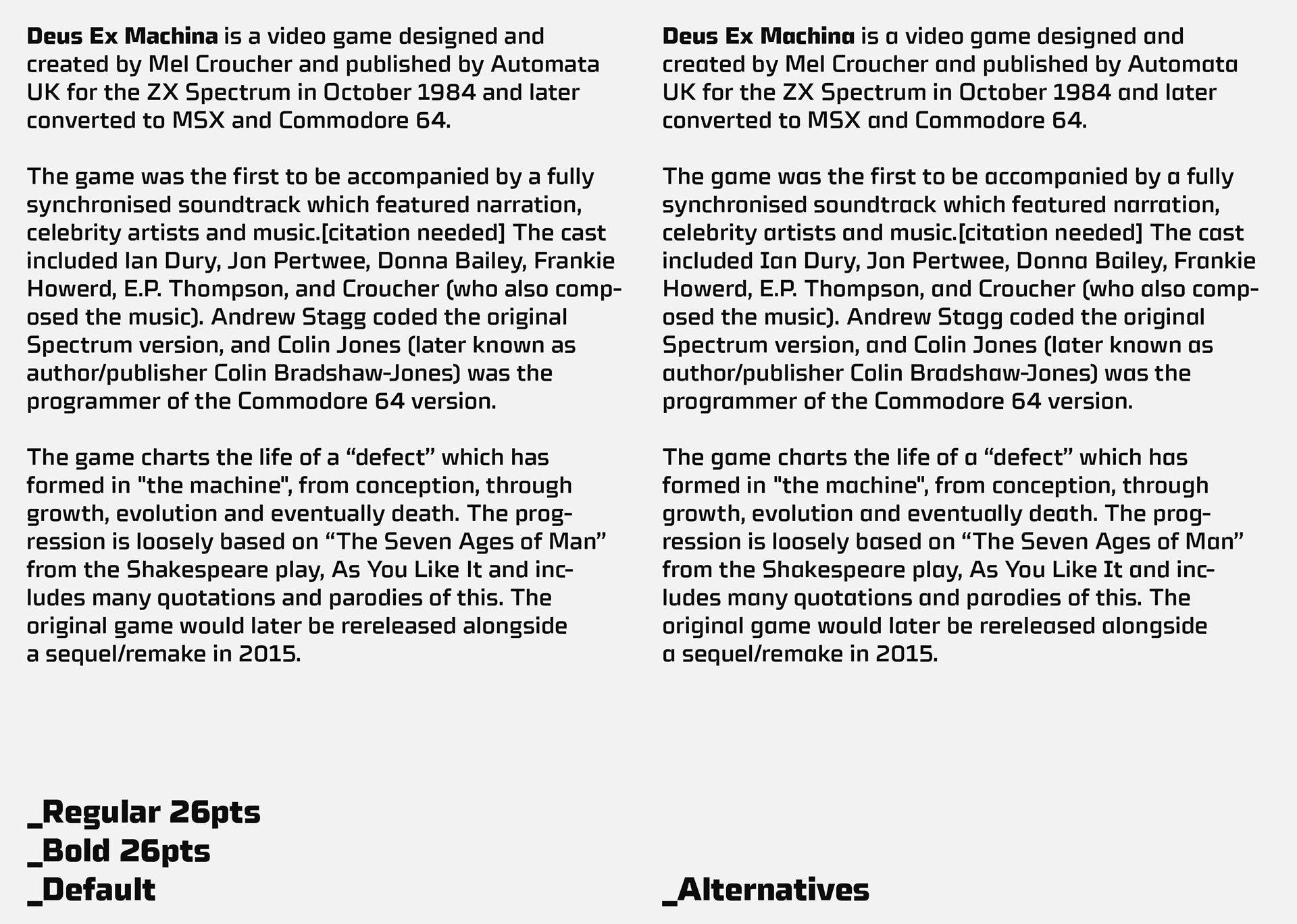
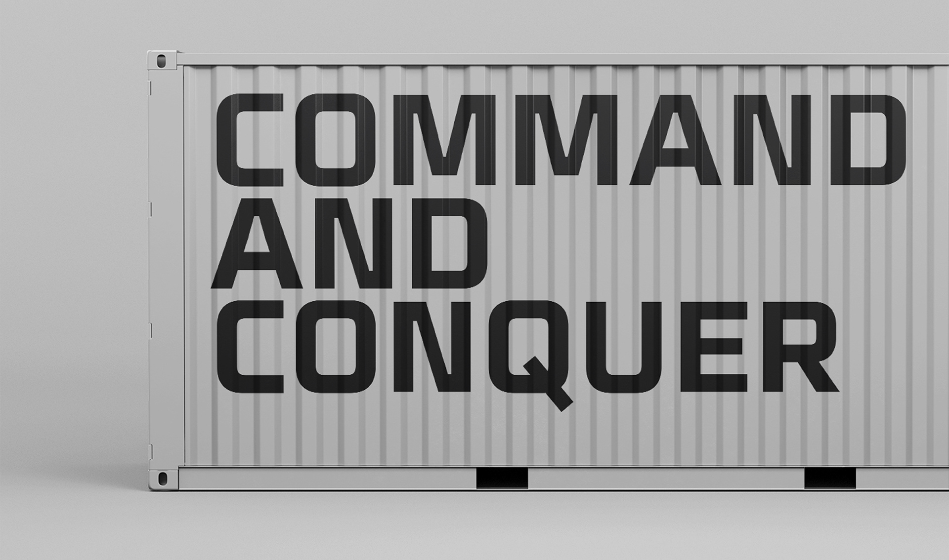
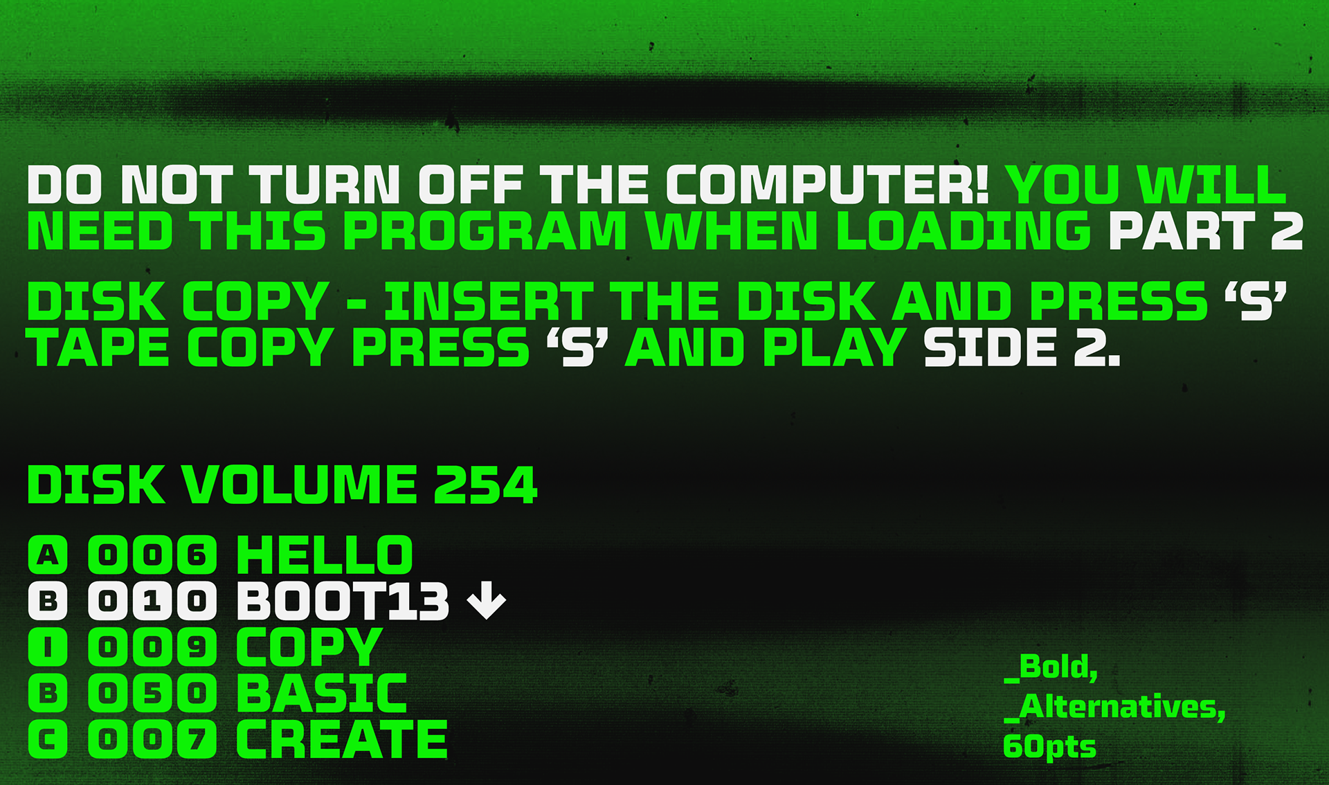
Celdum is a square sans serif shaped by the discipline of a rectangular grid. Its forms balance smooth curves with strict verticals and horizontals, producing a mono-line design that feels both engineered and purposeful. Rounded corners soften the geometry just enough to keep it approachable, while maintaining a clear mechanical tone. Version 2.0 takes the idea further. Ink-traps add sharper detail and a more industrial character, while improving clarity at small sizes. The boldest weight has been reinforced for striking impact in headlines and display settings. The slanted styles are drawn as obliques, maintaining the structure of the uprights and ensuring emphasis feels integrated and uniform.